.png)
Let’s play a quick recall game. Can you visualize the logos of these famous brands: McDonalds, Starbucks, Nike, Adidas, Amazon, BMW, and Ford? You must have remembered the logos for most of them. Now if their products didn’t have their logos on them, would they still be considered special? Not really!
Logos add to the identity of the product and a big challenge for the brands is to make their logos and brand name memorable. Imagine you are selling an amazing product. You are heavily advertising it and people are noticing those ads. When you take a quick survey to see how many people remembered the ad, you find out that barely anyone could recall your brand but they could recall the product. Does this mean your ads did well?
If people can’t remember who is selling the product, then the ad has not achieved its goal. People will eventually forget the product but if they could recall the brand name and logo, there are much higher chances of them buying from you. In a survey, 50% of consumers stated that they are more likely to choose a company whose logo they can easily recognize. For 42% of consumers, a company's personality is reflected in its logo, and over a third of consumers connect a good logo with high-quality business.
One important way of making your logo noticeable is by placing your logo in the right spot.
Why is logo placement important?
Other than people being able to remember your brand, logo placement is important for several other reasons:
- Ensuring your logo is in the right spot is crucial for a strong brand image. Always prioritize your logo placement guide to avoid any misrepresentation. Following specific branding rules like logo placement and consistency highlights professionalism in your branding strategy.
- For marketers, knowing the logo placement guide is crucial. It helps them understand where to put the logo for the best impact.
- Some believe the logo placement guide matters mainly for print, especially on merchandise like shirts and bags. However, it extends beyond that. Digital channels, from websites to social media, are vital for attracting daily traffic. Your logos on these platforms represent your identity, making it crucial to choose placements wisely.
What Does the Research Say?
Once you have designed your logo, it should be placed on every single platform where you have your presence. Apparently, there are three schools of thought about where to place the logo: in the top-left, top-middle, or top-right corners of a page. So the question remains: which position is right for your logo?
According to UX best practices, your logo belongs in the top-left corner of your website. It makes sense because:
- For most languages, we read from left to right, so our eyes naturally look at the left side first.
- In the early days of web design, logos were consistently positioned on the left, and that's still the assumed location for most people today.
Despite the logic, there are some brands that take the offbeat path by placing the logo elsewhere. If you're firmly committed to placing your logo at the top center or right, there are advantages, including being unconventional, setting yourself apart from competitors, and grabbing attention. The choice of logo placement depends on its usage.
If you don’t feel adventurous and want to see what the research says, we have got that for you as well.
Researcher’s Experiment
The Nielsen Norman Group performed an experiment to solve the confusion about logo placement. They performed two studies one to check left vs. right and the other to check left vs. center
Left vs. Right
In a left-versus-right study by NNGroup, they conducted a test with 128 users, each exposed to either the original website with a left-aligned logo or a manipulated version with the logo and navigation on the right. After a minute of review, users were asked questions and shown hotel website photos to measure logo placement's impact on brand recall.

Results showed that:
- Left-aligned logos had a higher brand recall (39% compared to 21% for right-aligned).
- Interestingly, despite the conventional left placement, respondents still considered left-aligned logos more "unique" and "stylish" than right-aligned ones.

Left vs. Center
Here, 50 users explored retail websites, encountering logos placed either in the center (eight websites) or on the left (six websites). When navigating, left-aligned logos performed better, with only 4% failing to reach the home page in one click, compared to a 24% failure rate for the centered logo.
Digging into logo placement studies reveals a clear winner: the left side. Let's break it down:
- Visibility Matters: People often overlook the right-hand corner for a logo, risking brand recall.
- Navigation Expectations: Users are accustomed to finding navigation in the top corners, making a centered logo confusing.
In a nutshell, left-aligned logos steal the show, capturing attention where the eye naturally wanders.
Things to take into consideration before deciding on your logo placement
Other than placing the logo on the left, there are several other things to keep in mind to get the maximum results:
- Standing Out from the Crowd
Aside from where you place your logo, its size matters. You don't want your brand to get lost among other elements.
Step back and see what stands out in your design. If the logo isn't easy to spot, make it larger, add white space, or adjust its position slightly.
Stick to the upper left but even a subtle shift can enhance visibility. Also, consider your color palette; on a dark background, a dark logo might not stand out. Aim for a logo that grabs attention. Experiment with gradients to make the logo area transition into a lighter or darker hue for increased contrast.
- Shifting the Spotlight
Sometimes, your logo doesn't need to steal the show. For example, Imagine you're hosting a community event at your local cafe to support a charity. If the event's focus isn't on your cafe but the community and charity, it's okay to downplay or omit your cafe's logo on the event signage. This ensures that the emphasis remains on community engagement and charity support, avoiding potential negative associations if the logo takes too much spotlight.
If a sign's focus isn't your product or service, it's fine to skip the logo or place it inconspicuously. Consider the implications before putting your brand name in the spotlight; you might avoid negative associations.
- Choose the right element
Your logo could be in the form of a wordmark, symbol, or a combination of both. If your product packaging has ample space, you might opt for the wordmark, but if space is limited, the symbol could be a better choice.

- Avoid changing its orientation
Many brands have specific guidelines regarding color, transparency, rotation, and scale to maintain consistency across all platforms. While creative packaging design is fine, establishing some restrictions for your logo and its placement guides your creative choices.
- Choose the size wisely
Experts advise against oversized logos, which can be perceived as overly assertive, especially for smaller startups. Major brands like Nike and Coca-Cola strategically use modest logo sizes, often placing them near the bottom.
Achieving the right balance is essential to garner attention without being overwhelming. Conducting controlled studies and seeking feedback from your target audience through surveys can help determine the optimal logo size.
- Format of the logo matters
Make sure your logo is in a format like SVG for easy resizing. Test it at different sizes and distances to ensure clarity. If it looks fuzzy or unclear, consider adjusting the design.
- Logo space
Ensure your logo stands out by providing adequate clear space, also known as the safety zone. Maintain a border of 10% of your logo's total width, creating a noticeable and memorable brand presence. When placing your logo on product packaging, consider factors like box edges and handles to guarantee visibility and brand recognition. Following clear space guidelines enhances your logo's impact and fosters a strong brand impression.
- Make your logo visible
Place your logo where it's visible to people. Consider practicality, like avoiding placing it on the back of a long-sleeved shirt covered by a jacket. Opt for front pocket placement when jackets are often unzipped. Always consider the context, such as whether the side or top of a shipping box is more likely to be visible.
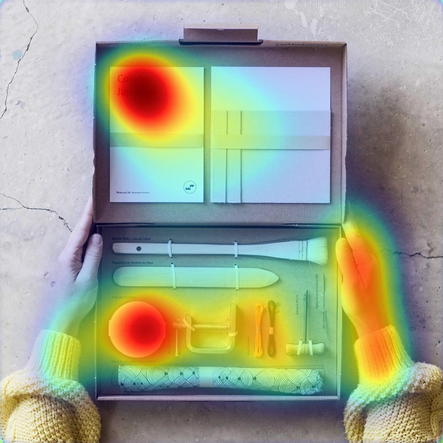
Another pro tip is to use attention prediction to predict how well your logo placement will draw attention. expoze.io is an AI platform that can be of great value in this case. All you have to do is upload screenshots of your website, billboard, apparel, etc on the platform and it will present you with an attention heatmap. This heatmap will give you a general view of what parts of your screenshots will get maximum attention. You can also be specific here and create an area of interest (AOI) around your logo. Through this, expoze will quantify the exact amount of attention the chosen area will receive, relative to its surroundings. You can then get creative and do A/B testing to see what area on the website works well for your logo placement.
For example, below is an A/B test of logo placement done between McDonald’s and Burger King on expoze.io. As can be seen, McDonald’s logo is predicted to receive only 0.9% attention whereas Burger King’s logo is predicted to gain triple the times more attraction. This shows how this simple A/B test was able to predict the best place for logo placement to get maximum brand attention.

Comparison of logo placement between McDonald’s and Burger King’s billboards. This A/B test was performed on expoze.io
Comparisons and Examples in Different Cases:
Website
Hubspot did what the Nielsen Norman Group’s experiment had found. They placed their logo on their website on the top-left. Placing your logo in the right-hand corner of your website may affect visitors' brand recall. People typically look for navigation in the top corner, so locating it elsewhere could lead to confusion in navigation.
It is all about a smooth and intuitive user experience. The top-left corner has been recognized as a natural place where the eyes go first, therefore placing your logo there could reap benefits. One important thing to keep in mind is that make sure your logo is scalable since your website will be viewed on different devices. If it’s not scalable then the quality of it will diminish, which will defeat the purpose.

Emails
For this as well, the left rule applies. For longer emails, consider placing the logo twice—both at the top and bottom. Get creative by using different logo variations; for instance, use the image and text at the start and only the image at the end.
Let’s take a look at Airbnb's email. Firstly, they took a more off-beat approach by placing their logo in the center at the start of the email. They managed to put another logo at the end of their email on the left. This assured that the readers saw their logo, if not in the beginning but at least at the end.


Packaging
Once your logo is in a visible spot, get creative with the packaging. April + The Bear uses branding on packing paper, adding a unique touch. Turn your logo into a pattern on tissue paper or custom tape for added brand presence. While creative packaging delights customers, ensure it complements your primary logo location, especially if your brand isn't globally recognized yet.

Apparel
You can get playful with logo placement on apparel! Whether it's front and center or a small section on the back, you can get creative on t-shirts. Experiment with variations—icon-only, business name, or any mix—as long as it's consistent. The choice is yours, so have fun with what you want to achieve with your apparel!
For example, Gucci places its logo in the center of the apparel whereas Polo does it in the top left corner. You can choose what works best for your brand.


Billboards
When deciding where to place your logo on a billboard, make sure it's easily readable amid the visual noise. Consider integrating it into the bottom half, like McDonald’s does in the bottom right corner, for a consistent and memorable brand presence.

Conclusion
Logo placement might look like a minor tweak in your product or website, but as we have uncovered in this blog, it can change the way people perceive your brand. Get creative with your logo placement but it’s also good to keep the research in mind to get maximum results.
.png)